Earlier this week IBM published a press release previewing the headline features of the upcoming new on-premises release of Connections:
IBM today announced it is bringing new capabilities to enterprise social networks for a simpler collaboration across the workforce and employee onboarding experience. The latest version of IBM Connections also integrates with IBM Cloud Object Storage, providing companies an ability to scale their storage needs with their employee’s usage while improving storage costs.
The press release most notably included the GA date for Connections 6:
The newest version of IBM Connections will be available on March 28.
Some of the key new features are mentioned in the press release:
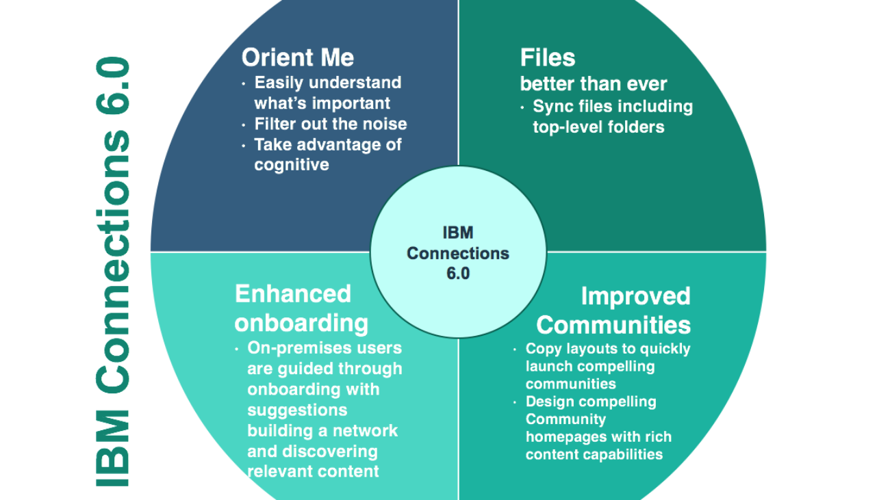
 A new Homepage experience (known as called ‘Orient Me’) designed to do a better job of surfacing topical and relevant content from across the individual user’s network. This new feature makes use of a new containerised, API-driven architecture to select and display the most relevant information for the user, providing a more interactive experience that the old activity-stream Homepage ever offered.
 Connections 6 also provides a “Touchpoint” onboarding experience for new users, offering a a more helpful and intuitive introductory process for new users, with easy login, ability to follow colleagues and join communities to begin working more efficiently. (A few years ago I discussed a previous iteration of the Touchpoint technology back when it was a paid asset offered by IBM Services.)
- The ability to copy designs and layouts from existing communities enables more effective and standardised community management, as well as saving time when setting up new use cases.
 An improved user experience for file access provides a simple to use interface and desktop sync for easier access to files, providing large file uploads, rich text editor, new preview/editing features in File Viewer and search improvements.
- Integration with IBM Cloud Object Storage enables a hybrid option for Connections, storing the ever-increasing volumes of social data and allowing companies easy access to that information for analytics and new learning.
All these enhancements are valuable for loyal Connections customers and their employees, particularly the new Orient Me feature which has been needed for as long as I can remember. It’s similarity to the Verse user experience is pleasing for those that run both Verse and Connections, and I look forward to testing the effectiveness of the filters and AI-driven content selection when it becomes available. (I would still like to have seen more options for pushed Corporate Communications-style content, rather than what seems to be a sole focus on content from the user’s network, but we can’t have everything…)
However, in my mind there is no doubt that the single most important enhancement contained in Connections 6 is not mentioned at all in IBM’s communication, and so it is that which I want to explore here.
It’s all about the Use Case…
My methodology for deploying effective and engaging online communities is based on a foundation of well-defined use cases, developed by understanding the immediate needs of employees and community members within a specific context, the issues they face in their current workflows and business processes, and the cast and audience that are (or should be) engaged within the activity being analysed.
Some (very high-level) sample use cases could be:
- A marketing team creating promotional campaign materials and delivering them to the sales channels
- A sales team working together and working with supporting teams to respond to a tender with a proposal for products and services
- A customer service team taking customer questions, finding the answers and responding to the customer
- A corporate communications team communicating the strategy of the company to all employees
- A research & development team creating new products and delivering them to the market
Once the use case is defined in detail, we move on to the containers, content types and interaction methods that will best support an improved approach within the online community. Lastly, we develop and publish wireframes that specify how use case content, calls to action and navigation will be surfaced within the community. Finally we build the defined use case within the technology, seed content and invite pilot users.
In this way, each and every use case has its own definition, interaction model, layout and flavour. Sure, common patterns are often a starting point (for example, communities of practice often follow a similar design and structure, no matter what the practice might be), but the look and feel of the use case will be different – the content types, calls to action, navigation and surfaced information will be specific and relevant to the use case supported.
This approach has always been difficult to implement in Connections. The definition phases could be undertaken, but when it came to delivering a customised experience for each use case that reflected the requirements of the audience, the process or workflow to be undertaken there, and the actions that users are being called to engage with, the static nature and feature-driven of the Connections community model was always a hindrance.
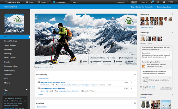
Here’s a relatively positive and visually appealing experience within a Connections community, taken from an IBM marketing screenshot:
Whilst the order of the widgets in the centre column can be customised, a graphical overview pane created, and a few of the community’s options tweaked, really every Connections ‘place’ will follow the same structure. Most critically, the various content types (blog posts, wiki articles, forum discussions etc.) can only be displayed in their specific widget, and with no real context as to how those content types should be used or when they are relevant. In addition, most follow a strict sort order, versus allowing curation by the community manager.
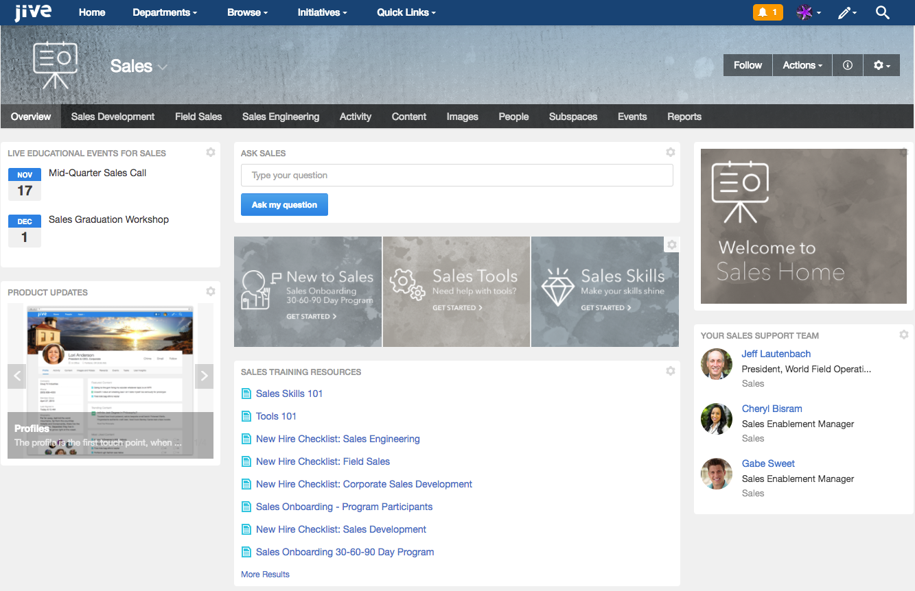
Look at how this differs from a similar Sales ‘place’ within a demo Jive environment:
The place owner gets to choose the column layout, the banner, the tile selection and placement, a variety of dynamic and static display options, including a number that allow curation of specific content, people, places and links.
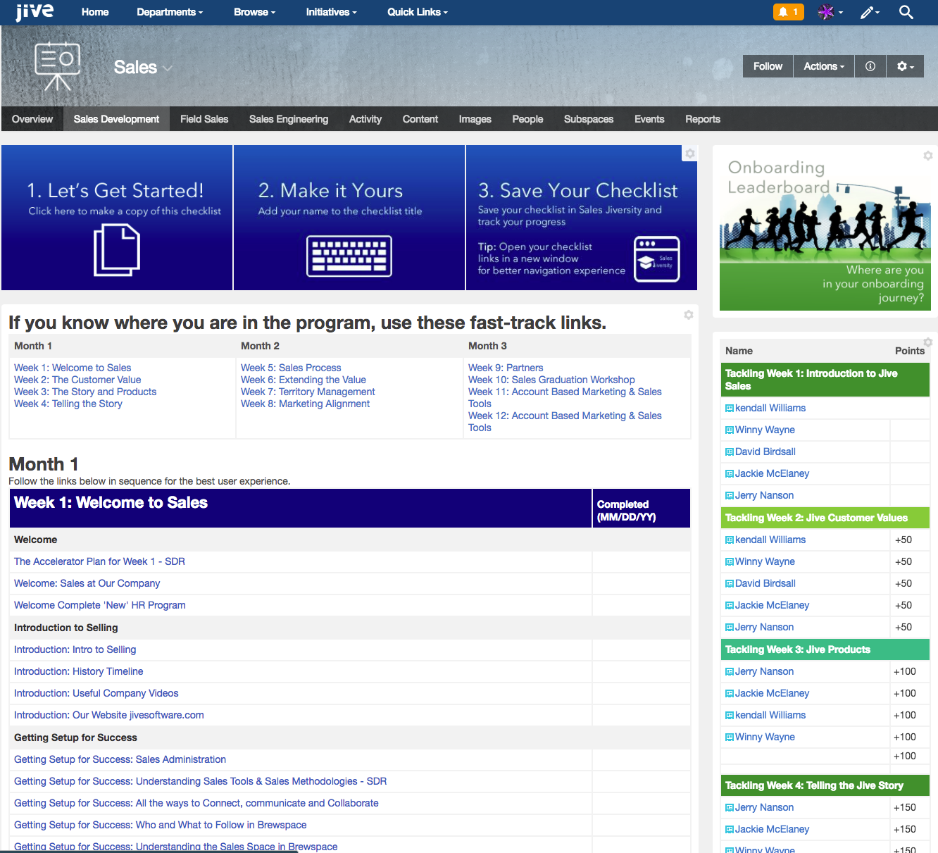
In addition, each of the first four tabs on the place header (Overview, Sales Development, Field Sales and Sales Engineering) are different layouts surfacing content within this place and from around the community:
[Please note that I don’t hold the above Sales place up as a particularly great example of design or configuration in a Jive context, it’s just a pre-seeded place that I have available to screenshot, and is somewhat similar in purpose to the IBM example.]
This isn’t meant to bash Connections, both that product and Jive-n/x have their own advantages and disadvantages, but it’s always been apparent to me that if we want to encourage specific groups of users (say Sales) to adopt our platform, or wish to support their specific use cases (a need to onboard new salespeople more quickly and effectively), then we have to have a means to create a user experience that is relevant, engaging and carefully considered. This needs to be easier to create
So what’s the killer enhancement in Connections 6?
In Connections 6, place owners will finally get the ability to create truly modern communities that better support a wider variety of use cases:

With new widget layouts, greater levels of customisation at the menu and design level, and a fresh new look, Connections 6 will allow community managers to create engaging places that suit the needs of their community members.

Whilst Connections communities still have some way to go to match the level of place customisation, navigation and curation available in Jive, these new features do bring Connections much closer, and more importantly allow existing on-prem customers and community managers to immediately improve the user experience for their users.
As IBM continues forward towards the vision that is Connections Pink, I would love to see them continue to further develop the community layout model, allowing more visual widget options (for those vital Calls to Action) and widgets that enable selection of multiple content types (all content tagged ‘project’, or all content created in the past 7 days, or featured content as selected by the community manager etc.).
However, this is definitely a step in the right direction, and I look forward to working with the new functionality!


[…] [Originally posted over at stuart-mcintyre.com] […]