Throughout 2017 (and potentially beyond), Monday is going to be Awesome Apps day here at McIntyre Towers. As yesterday was a holiday here in the UK, we’re a day late this time, but we’ll be back on track next week!
Since going iPad Pro back in the early summer, 95%+ of my online hours are now spent on iOS. Between the 12.9″ iPad Pro and iPhone 7 Plus, I am at the stage where almost the entirety of my consultancy business can be run on the iOS platform. This has taken some work, with innovative solutions required for specific elements of my workflows, workarounds needed for where specific vendors do not support admin or creative functionality on mobile, and new apps discovered to replace tried and tested options used on OS X macOS. I’ll spend more time discussing the benefits and challenges of the transition in later posts, so let’s crack on with this week’s apps.
Each Monday I’ll be selecting a couple of tried and tested apps that I use on a regular basis – one that is business or productivity-related and another that adds value during leisure or down time. Given my professional focus is on collaboration and community, and my work involves documenting and delivering strategic recommendations, facilitating workshops and training large groups of executives and community members, I’d expect that a good number of apps will be useful in those and similar scenarios.
So with that in mind, let’s get started…
Business App of the Week: Bear
Taking Notes
I spend a lot of time in workshops, remote meetings, presentations and on public transport heading to and from customers. In all those situations, it is imperative that I can effectively gather copious and detailed evidence of the discussions and decisions that took place, my thought processes around next steps and recommendations, and to document the actions that will follow. Often the notes are in the form of long bullet lists of key concepts and participant quotes, however there are usually also diagrams involved, photos of whiteboard and flipchart sketches, and the occasional audio recording too. Therefore an app that enables efficient and flexible note-taking is an essential element of my mobile kitbag.
First, Evernote…
![]() Like many in this industry, I’ve spent many years using Evernote for this task.
Like many in this industry, I’ve spent many years using Evernote for this task.
Evernote was one of the first truly platform-independent note-taking apps, and offered a ton of productivity tools in an relatively easy-to-use freemium app. Whilst it always had its UI oddities and weirdly-implemented features, the ability to easily share notes with others, to capture paper documents quickly and effectively using the Scannable app, and to organise groups of notes into Notebooks were all very powerful.
However, over time it felt as though app development stagnated (at least partly as Evernote started to focus on selling themed accessories such as backpacks and water bottles, rather than the service itself), the organisation model somewhat fell apart as note volumes scaled into the thousands, and the cost of the paid service was increased (currently the top-level plan is £44.99/year). Also, Evernote always seemed to take a little too long to adopt new iOS features, and as an iPad Pro user, it felt as though the Evernote UI didn’t really make the best use of the screen estate available. Lastly, the recent privacy scare suggesting that Evernote employees can read our content hardly gave users the reassurance that their ideas and business IP was safe on the service.
Some Alternatives
So, over the past six months I’ve spent significant periods trying other options in this space. Honourable mentions must go to Apple’s Notes (included in iOS) and Microsoft’s OneNote, plus I’ve tried a number of other smaller third-party apps. Ultimately, none has quite satisfied as my primary notes app.
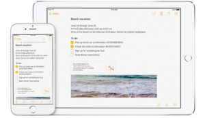 Notes does a great job in a few areas, most particularly in terms of Apple Pencil support – even a year into Pencil availability, I haven’t yet found another app that does such a fantastic job of responsive interaction with the stylus. It is a real pleasure to sketch out diagrams and schematics in Notes, and annotation works really well. Of course, Apple gets some major advantages in terms of owning the platform itself which clearly helps with Pencil support, but also when integrating with other apps – particularly first-party options like Mail (not that I use Apple’s own apps often). Note sharing and and synchronisation are also well-implemented. However, the rest of the Notes experience has been disappointing – the organisation options are limited (folders, but no tags), and I long for more formatting controls in the Notes themselves. I also worry about using a first-party Apple tool in terms of being able to fully export content later on, and with major updates being linked so tightly to the annual iOS release
![]() OneNote is receiving a lot of positive press since its last update, and it’s fair to say that I’ve been impressed with the UI and the functionality it has offered. As you’d expect, it is truly cross-platform and is free to use on iPhone – to get the full value from the app on iPad, you’ll need an Office 365 subscription. The drawing tools are great, they’ve done a good job of multimedia support, and the UI is as intuitive as Microsoft tools ever are. Whilst I’ve never been a fan of Microsoft Office, I have to say that they’re knocking it out of the park in terms of their recent iOS releases – the apps are way more appealing and enjoyable to use on iPad and iPhone than they have ever been on Windows or macOS.
OneNote is receiving a lot of positive press since its last update, and it’s fair to say that I’ve been impressed with the UI and the functionality it has offered. As you’d expect, it is truly cross-platform and is free to use on iPhone – to get the full value from the app on iPad, you’ll need an Office 365 subscription. The drawing tools are great, they’ve done a good job of multimedia support, and the UI is as intuitive as Microsoft tools ever are. Whilst I’ve never been a fan of Microsoft Office, I have to say that they’re knocking it out of the park in terms of their recent iOS releases – the apps are way more appealing and enjoyable to use on iPad and iPhone than they have ever been on Windows or macOS.
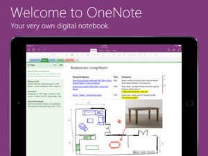 So all that said, why am I not using OneNote full-time? Whilst it is an impressive app in its own right, I am always fearful of the potential for lock-in to the rest of the Office suite – I’m a real believer (particularly on iOS) of well-integrated best-of-breed apps versus a one-size-fits-all solution that requires subscription to multiple apps that one may not use. Secondly, and more specifically, I’m starting to rely on Markdown as my writing format on choice, and OneNote on iOS does not support this (neither does Notes).
If you’re not familiar, Markdown is a universal text markup language (developed by John Gruber of Daring Fireball fame), that allows text to be formatted using an easy-to-learn syntax thus enabling intuitive text- and keyboard-only writing that is easily transferable between applications and platforms. As use of Markdown becomes increasingly natural – I’m starting to ‘think’ in Markdown these days – support is becoming a non-negotiable when selecting applications. Whilst this isn’t yet the case for everyone, I do think that even the larger app creators (and web platform developers) are starting to get the message that Markdown (or more accurately, MultiMarkdown) is an important standard to support going forward.
So what about Bear?
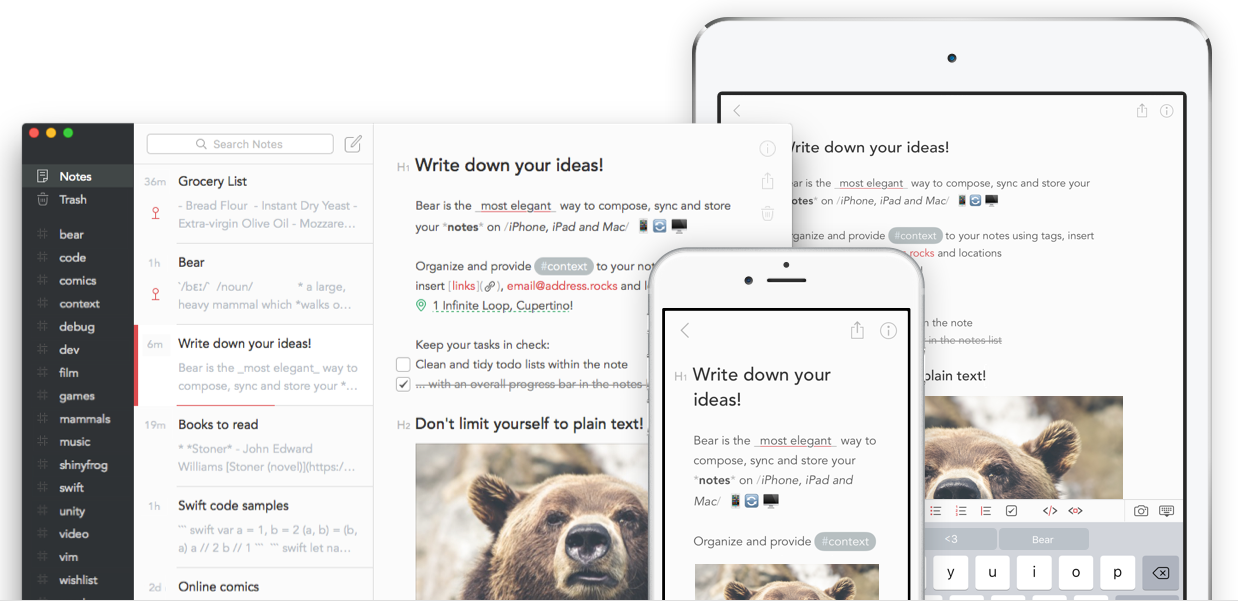
![]() There is definitely space for an independent note-taking app that competes head on with Evernote, Notes and OneNote, and whilst it is still relatively early days, I definitely believe that Bear is one that has a real chance of doing so.
There is definitely space for an independent note-taking app that competes head on with Evernote, Notes and OneNote, and whilst it is still relatively early days, I definitely believe that Bear is one that has a real chance of doing so.
Bear was released back in the autumn by Italian-based developer, Shiny Frog. Available for macOS, iPhone and iPad, it promises to be a ‘beautiful writing app for notes and prose‘, and I think it hits the mark in a big way.
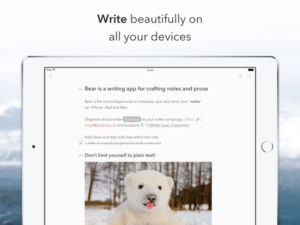 In Bear, all are stored in plain, portable text and hashtags are used to organise content in a flexible and adaptable way to suit your needs. Advanced Markdown is supported, as are multiple alternative formatting options including custom markup shortcuts to allow styles and links to be added with a keystroke or tap. The editor supports and automatically highlights more than 20 programming languages. Images can be embedded inline, and todos can be added to individual notes. Rich previews are available whilst writing so you see prose, not code.
Search is powerful, with options to search for specific types of content using search triggers – e.g. @task to find all your todos, @tagged “ideas” to find your notes that are waiting to blossom, or @files to find all notes with attachments.
Tagging of content is super simple – just include a hashtag in your content, and the note will automatically be tagged with that term. Bear can also group related tags together as sub-tags, e.g. #social/twitter – the ‘twitter’ tag will become a sub-tag of ‘social’. Multi-word tags are also supported – just add a second hash at the end of the tag, e.g. #social/blog platforms#. Cross-note links can also be used to build a body of work, quickly reference other notes, somewhat akin to wiki links.
One feature I’m really enjoying is the Focus Mode, allowing notes and other options to be hidden when getting content down is what matters.
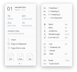 Bear really is as beautiful to use as the developers suggest it is. The design has obviously been very carefully considered, and there are a lot of delightful touches that become apparent as you dive into the more advanced areas of the app.
Bear is available for iOS (iPhone and iPad, including iPad Pro 12.9″ support) and macOS, and is free to download. There is a Pro plan, which costs $1.49 monthly, $14.99 annually, and is bought via an in-app subscription. This includes several of the more advanced features, such as sync between devices, application themes and exporting. I’d purchased the Pro option within a few hours of using the app – that’s how good it is.
Here’s the promo video for the Bear app, demonstrating some of the key features:
If you want to reader a deeper analysis, and to get another independent perspective, check out Federico Viticci’s MacStories review.
I genuinely enjoy using the app on a daily basis, and have migrated both my Evernote and Notes content into the app. I do miss some of the sketching and media options available in Notes, but the capabilities and design of Bear more than compensate, I simply use other apps for those requirements (there we go again, best of breed versus one-size-fits-all…). The scanning and capture aspects of Evernote have been replaced by Scanbot, which has similar abilities, but also supports saving to iCloud, Dropbox and many other services.
I heartily recommend you give the free version of Bear a try. There have already been significant improvements to Bear since it was first released, and even if you don’t migrate across today, it’s well worth having on your device to keep checking back as it develops further.
Leisure App of the Week: Infuse Pro 5
There are no shortage of really impressive video consumption apps on iOS, but the issue is usually getting your videos onto the device versus watching them. Also, all too often, the attractiveness of the content itself is rather overshadowed by rudimentary user interfaces and ill-conceived menus and options.
![]() Infuse is a freemium app that is simply beautiful to use (not unlike Bear), that really adds to the content you are watching. It supports streaming and local media, two-way trakt sync, subtitles (both stored locally and automatically downloaded) and can cast via AirPlay to AppleTV and to other devices such as ChromeCast, or display via an HDMI or VGA connection. It plays just about any media format (all the way up to 4K), including the standard MP4, M4V and MOV – plus MKV, AVI, WMV, MTS, FLV, OGM, OGV, ASF, 3GP, DVR-MS, WebM, and WTV. Includes fully certified Dolby Digital Plus (AC3/E-AC3), DTS and DTS-HD audio.
Infuse is a freemium app that is simply beautiful to use (not unlike Bear), that really adds to the content you are watching. It supports streaming and local media, two-way trakt sync, subtitles (both stored locally and automatically downloaded) and can cast via AirPlay to AppleTV and to other devices such as ChromeCast, or display via an HDMI or VGA connection. It plays just about any media format (all the way up to 4K), including the standard MP4, M4V and MOV – plus MKV, AVI, WMV, MTS, FLV, OGM, OGV, ASF, 3GP, DVR-MS, WebM, and WTV. Includes fully certified Dolby Digital Plus (AC3/E-AC3), DTS and DTS-HD audio.
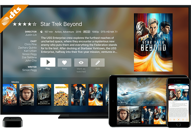 Infuse can stream videos stored on your Mac, PC, NAS, Wi-Fi hard drive, UPnP/DLNA apps like Plex and Kodi (XBMC), or from cloud services like Dropbox, Google Drive, and OneDrive – no syncing required (though you can sync the files locally for offline use as well).
As I mentioned up top, Infuse is gorgeous to use, with an attractive magazine style UI, with media artwork and metadata automatically downloaded and added. The latest version (Infuse 5) also supports iOS 10 features such as Split View and Picture-in-Picture.
The paid version, Infuse Pro, enables additional video formats, surround sound, AirPlay and Google Cast, videos stored in cloud services and syncing between devices. Infuse 5 Pro is currently $12.99 to download as a standalone app, or bizarrely (probably due to a seasonal discount) is significantly cheaper as an in app purchase upgrade in the free version of the app.
I use Infuse all the time, particularly for loading movies and downloaded YouTube videos onto my iPad before business travel. I love that I can simply point the app at my Plex server, or at a Mac system and suck down whatever videos I need, which are then auto populated with meta data, images, subtitles and the like. Do give the free version a try, in most cases this will be all you need.
Lastly, a Bonus App… Duet Display.
![]() The top paid productivity app in the App Store right now is Duet Display.
The top paid productivity app in the App Store right now is Duet Display.
This will come as no surprise to those that run both Mac and iPad platforms, as Duet is an app that adds value to both by allowing the iPad (or iPhone actually) to be used by the Mac as an additional display. Simply purchase the app on the iOS device, download the free helper app on the Mac and then connect the two with the usual USB-Lightning cable. The Mac sees the iPad as an additional display, and the standard Mac display options are then available – arrangement, scaling, dock location etc. You can even use touch and/or Pencil input on the iOS screen. It’s fantastic, seriously!
So why mention this as a bonus?
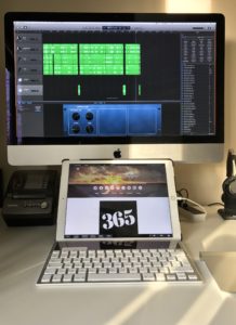
A couple of weeks ago, the Duet Display app was updated with Touchbar support. Yep, that’s Touchbar as in the #1 new feature included in the latest Macbook Pros.
So how does this work? Well it’s definitely of most use on a desktop Mac such as an iMac, Mac Pro or Mac mini. Place your iPad on your desk between your keyboard and your desktop display, connect the iPad to the Mac, start the Duet app and enable the Touchbar option. Now, the Touchbar UI takes up the bottom 1cm or so of the iPad device, with the remainder of the iPad display available to the Mac as your second (or third screen). This faux-Touchbar acts just as the hardware Touchbar does on the Macbook Pro, and automatically adjusts depending on the Mac application that has focus.
Of course, in this scenario, the Touchbar will duplicate the function keys on your hardware keyboard in some situations, but in many cases you’ll gain significant new flexibility in terms of manipulating application features such as video scrobbling, colour selection and so on.
Duet Display is currently on special offer in the App Store and is available for $9.99.
Wrap Up – The Links
- Bear – beautiful writing app for notes and prose
- Infuse 5 ~ an elegant video player & Infuse 5 Pro
- Duet Display
Do you use these apps? Or maybe you prefer alternatives?
Let me know what you think… Add a comment below!

